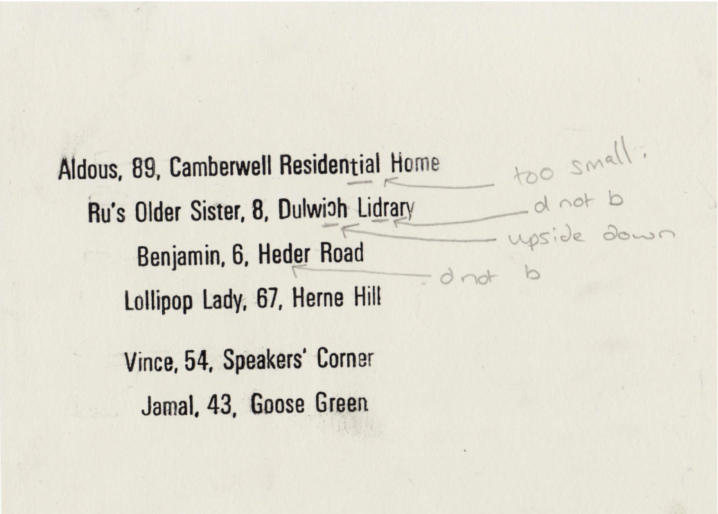
Letterpress workshop is back open! Unfortunately the letterpress studio has been closed for the last month, so I wasn't able to set up any type or do any printing, but I did have time to work out digitally the composition for the posters and what information I would like on each poster and of course what typeface I would like to use. I photographed the posters so far- then edited them in photoshop. I have chosen to use Univers Light Condensed, I love the ampersand from this typeface, and just think it is a rather beautiful typeface to work with. (little to my knowledge did I know how awkward it is to set up, a challenge I love to take on!*) Main pieces of information about the quotes shall be ruled then say the name of the person, their age, and where I spoke to them. Then in silver (10pt univers) in the bottom left hand corner, left aligned, shall be information about the series.
e.g. Fleeting Phrases, 1 of 6 quotes that encouraged a smile. Made with (set in?) Gill Sans & Grot 9.
This is done in silver and smaller type as I feel the details of the person are what count and I see this as additional information, that is maybe not necessary but what I feel should be included.
Letterpress Studio
Just to show what it is like to work with small type in letterpress (luckily not 6 pt this time around).
The type is first set in a composing stick (left) because all of these are to be easily set in a bed, I have made them all the same line length (according to the longest line). Using leads on the base and top of each sentence, I then spaced out the lines of type, so they fitted the appropriate line length. I spaced these using quads, thicks and thins, making it sturdy to work with when later printing.
Obviously after proofing the type there are always a few errors, which due to the size of this type meant I had to work with tweezers, to replace certain letters (seen on far right photo). I shall set up the printing bed tomorrow and hopefully print some of the silver on the posters.
*Difficulty with Univers typeface.
- From what I can gather after speaking to James (the technician) there are different heights of type across the World, European (called Didot spacing) and Anglo American (English, American). This means that 12pt in America and England will be the same height but a different height in France or Sweden. Univers is a Swiss typeface, created in European heights, to work easily in studios here, they converted it to Anglo height, but obviously its a tad complicated and makes spacing awkward to do. Creating a wave like effect when printing if correct height spacing isn't used.


 I have spent the last 2 days, a total of 12 hours letterpressing, a bit of back ache, a lot of giggles and some useful bits of knowledge have been gathered along the way too. But they are finished I have printed both the silver ink, along the left hand side and the pantone black ink in the centre (roughly- looked better slightly off centre thanks to the silver being on the left hand side, when centred literally using a ruler, didn't physically look centred, balanced this by adding a few mm along). Due to luckily prior thinking through of the task I was able to set up a slot for the type to go in each time I was printing different posters, making this a lot quicker and easier process. (worth the effort to space appropriately in advance). Still need to buy frames for these to go in to for the exhibition, but that will get done soon. It is now time to more on to how to package these when sold- which I am almost finished doing, using bright colours (specifically fluro) to keep this theme throughout.


